About the book
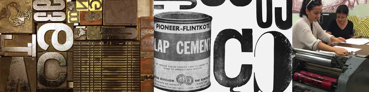
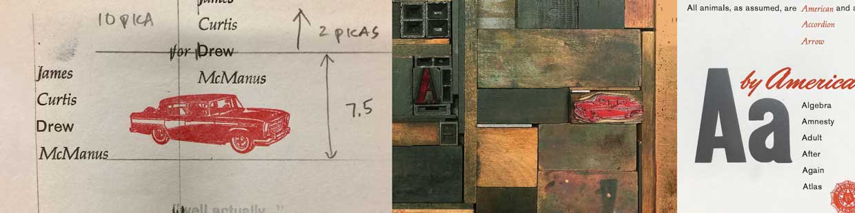
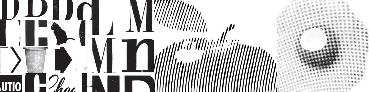
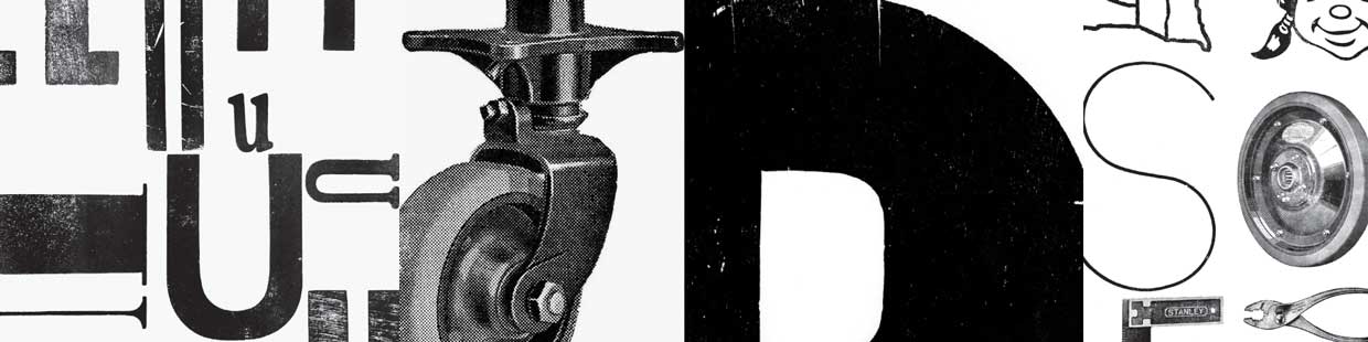
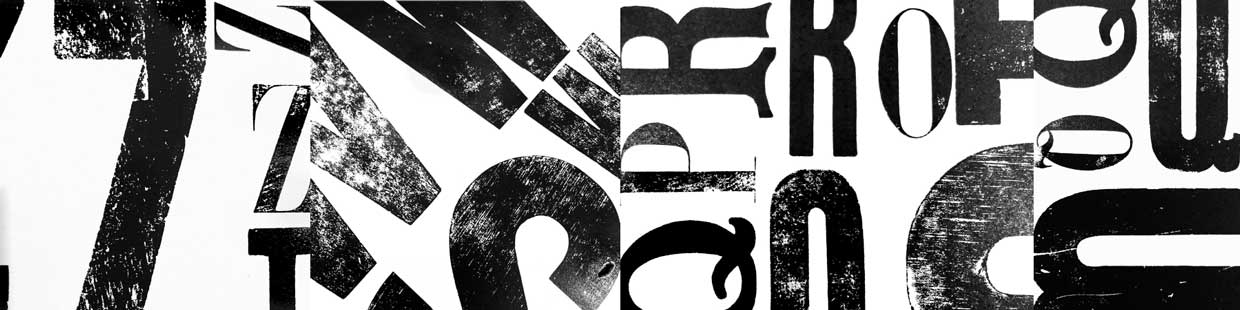
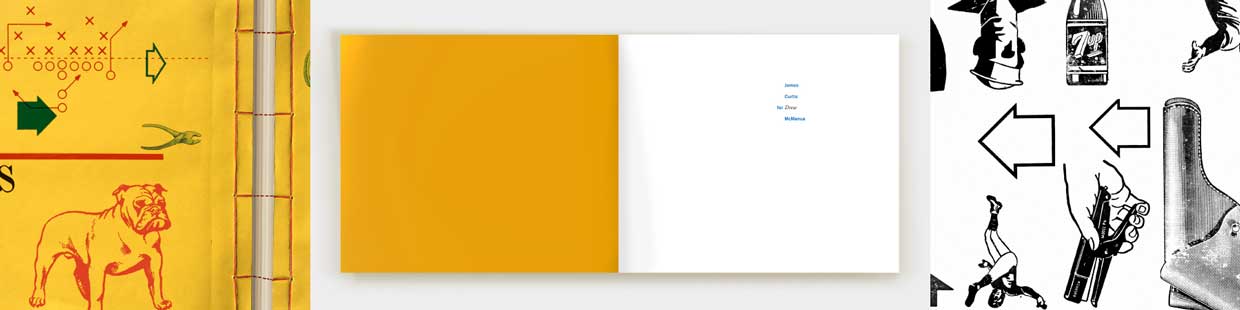
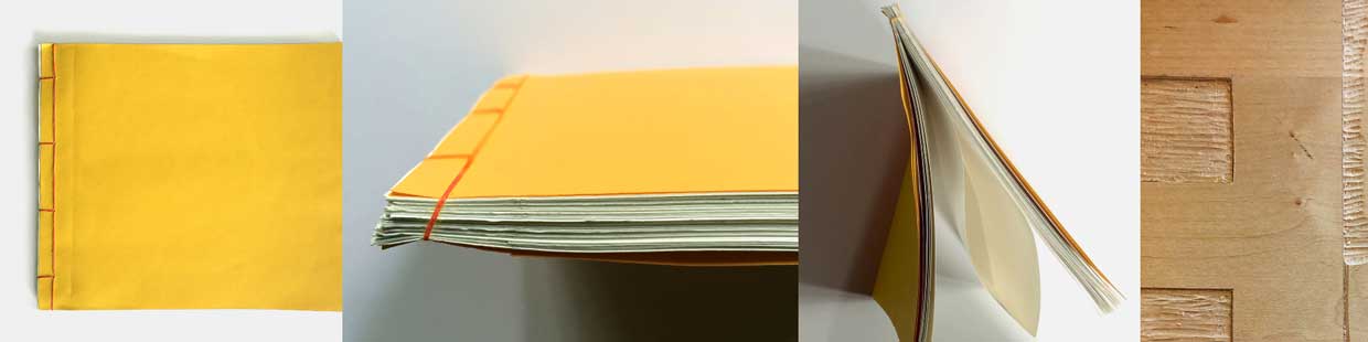
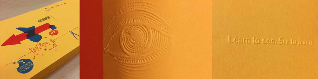
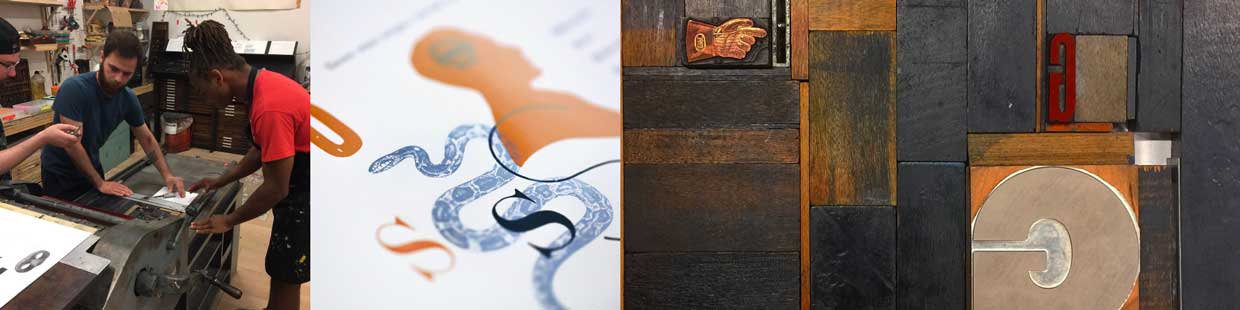
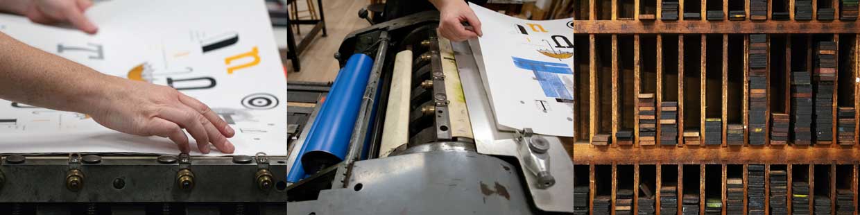
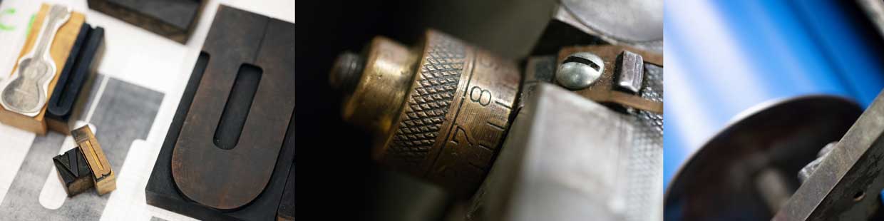
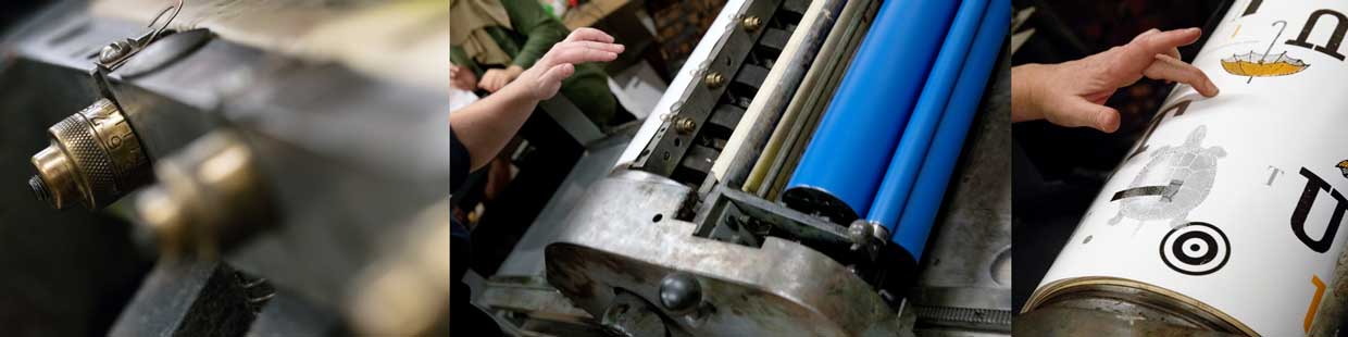
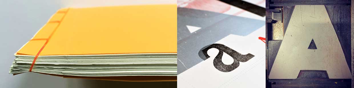
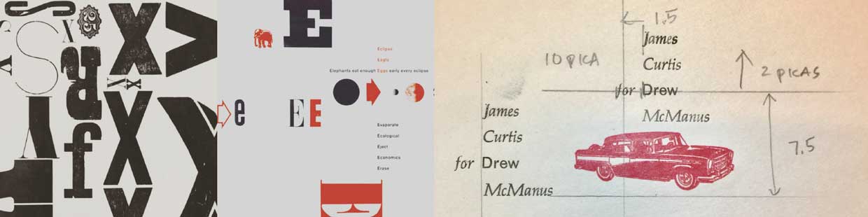
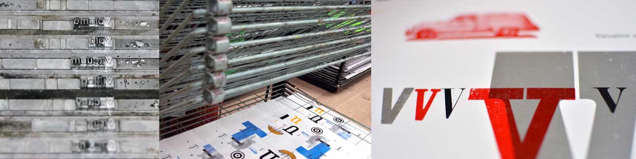
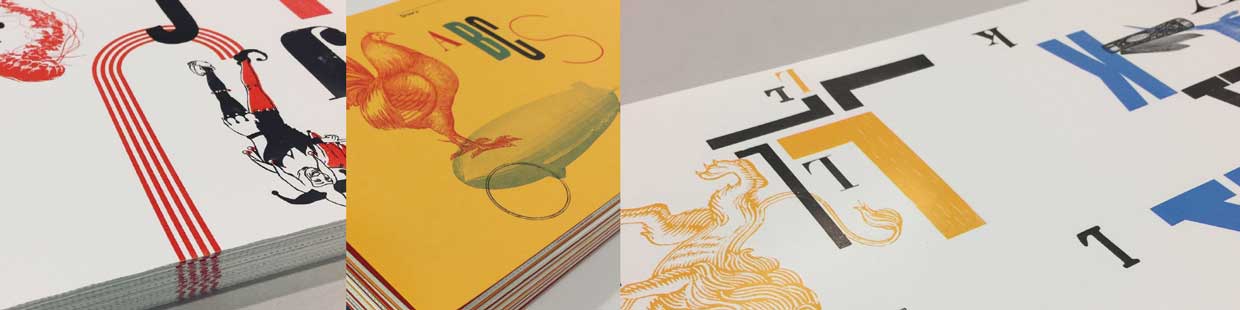
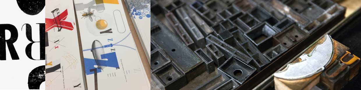
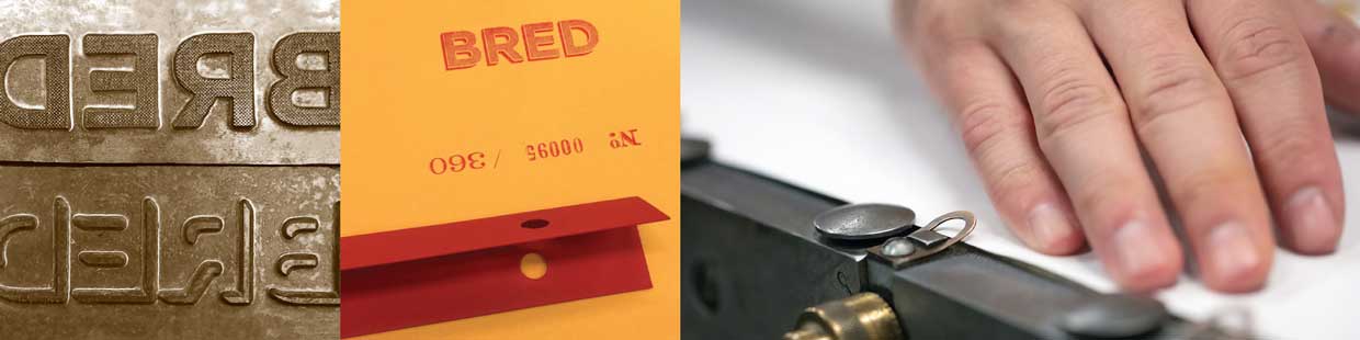
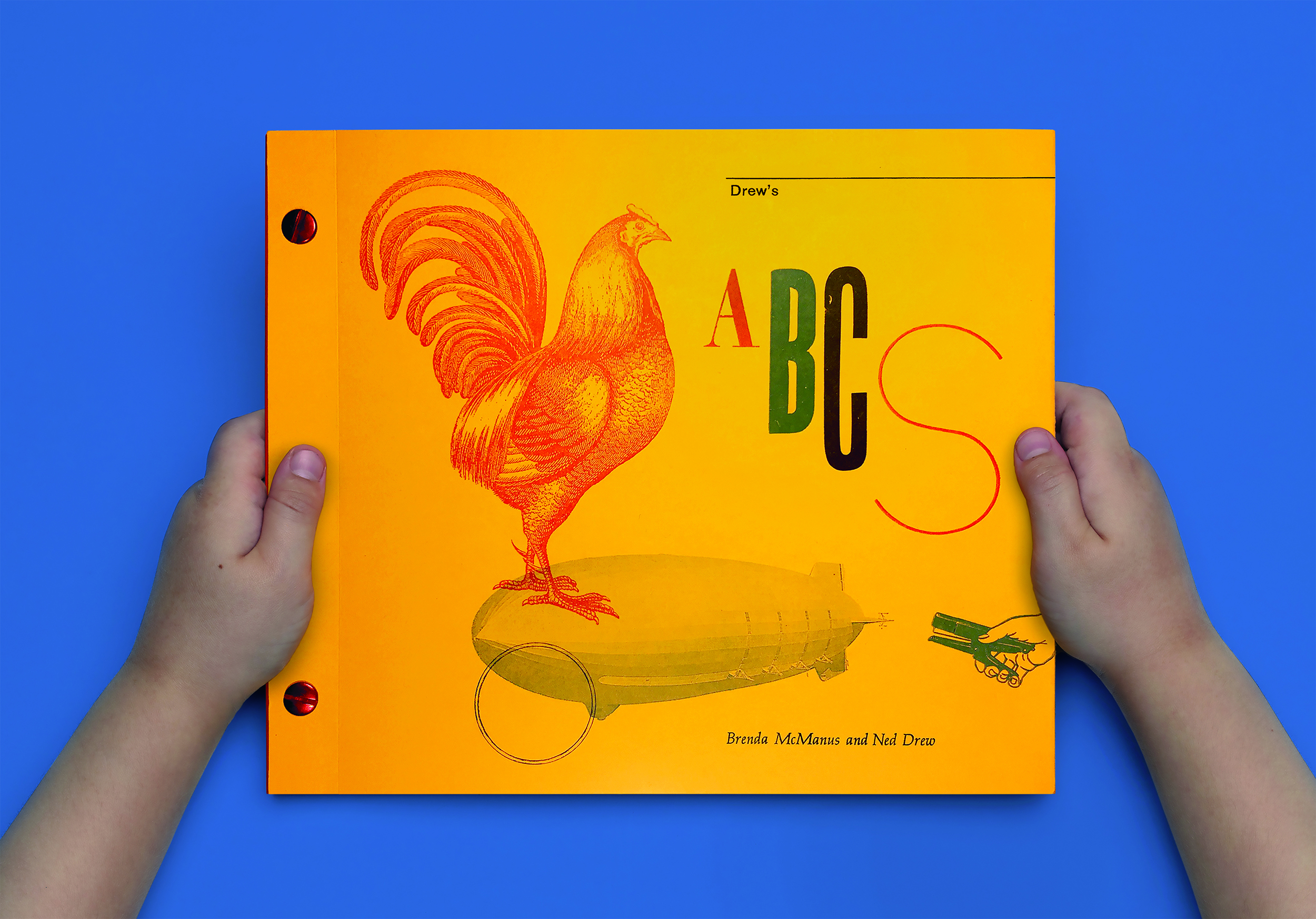
The book entitled Drew’s ABCs is a project of passion that we have been dreaming about accomplishing for the past 5 years. For 20+ years we have been collecting and building a library of woodblock type and line engraved images. Which we recently put into use producing a limited-edition book of ABC’s inspired by our young son. Limited to an edition of 360. The alphabet comes to life on the pages, its design is simple yet complex and both visually balanced and dynamic. The concept for the book is to expose the richness of diversity within typography and celebrate its differences.

THE COMPLETE BOOK

Our story

our inspiration
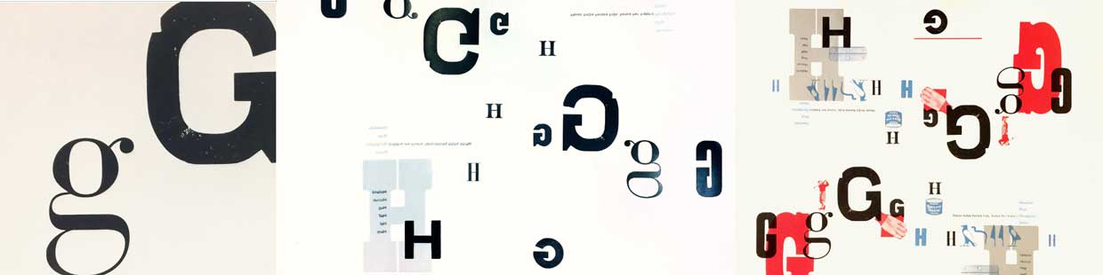
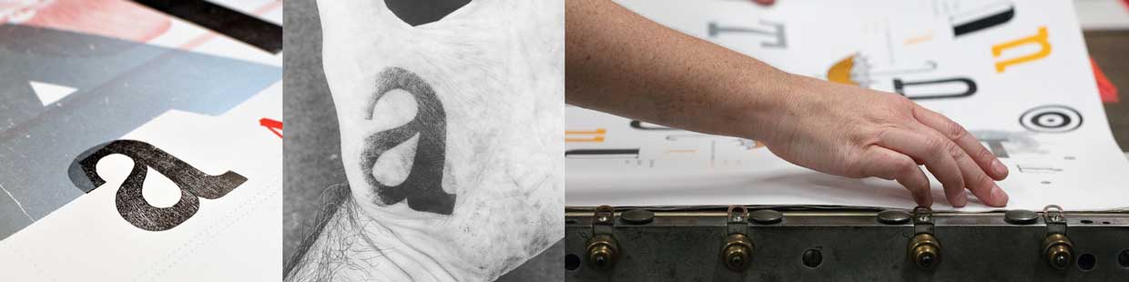
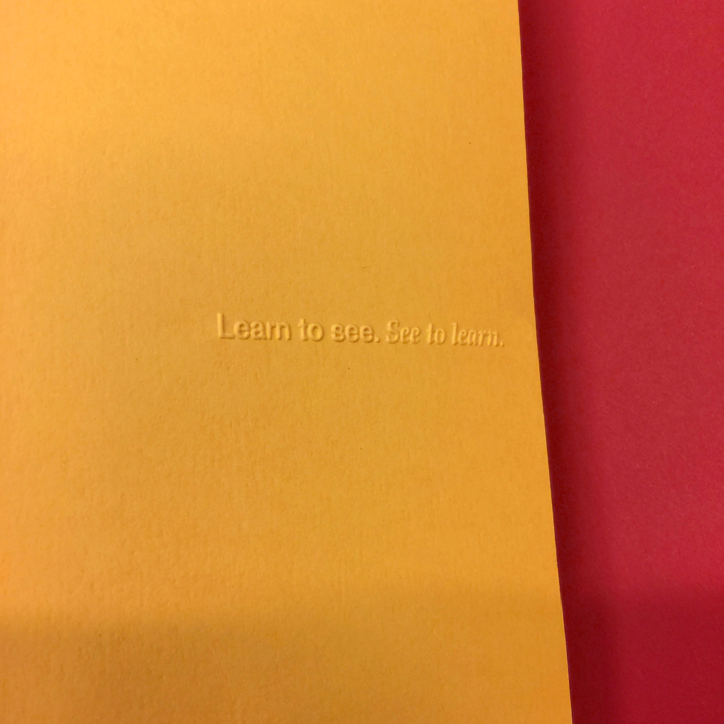
Drew’s ABCs started as a personal exploration focused on our young son and his introduction to letterform recognition. Small, large, thin, thick, serifs, san serif, bold or light, an “a” is still an “A”. Identifying subtle differences, discovering they are all different yet the same revealed an opportunity to celebrate and embrace diversity in a playful manner. As designers, we intuitively rely upon our design skills to teach and learn how to see and understand the visual world. Our collaboration began with the shared goal of integrating our passions and collection of the design artifact through an awareness of the diversity of typographic forms as an educational opportunity. We sensed the project could expose a new audience to our shared love of history and typographic craft within a book form, a medium that engenders intimate learning experiences that foster dialogue. Something we as parents have a deep appreciation for.

How the book works
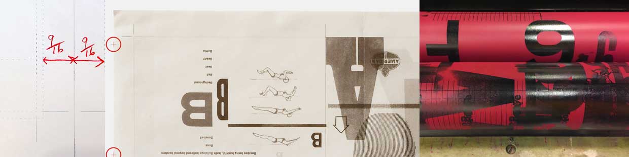
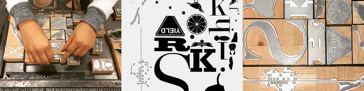
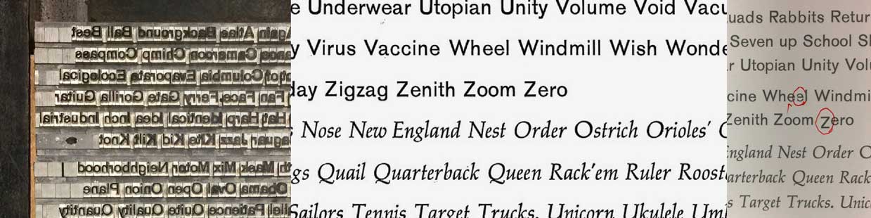
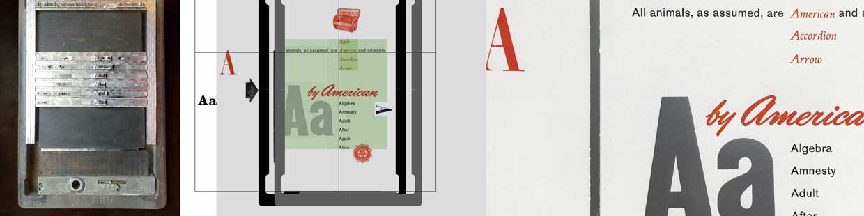
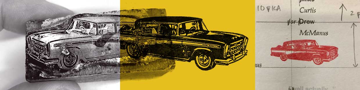
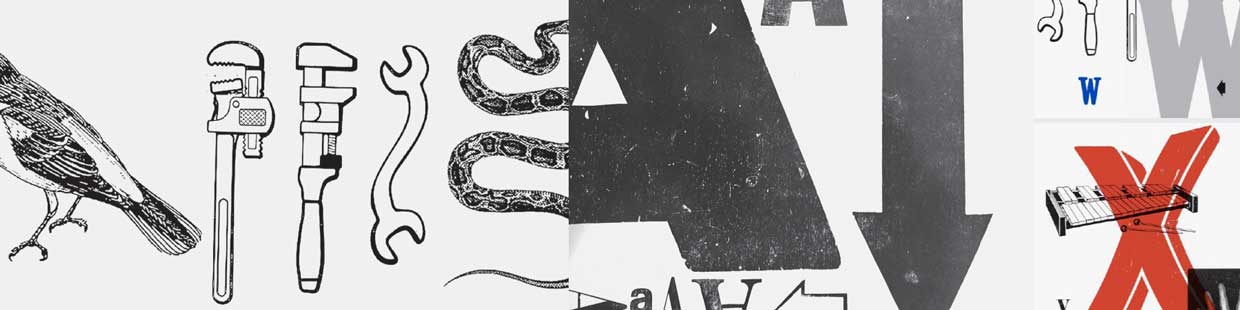
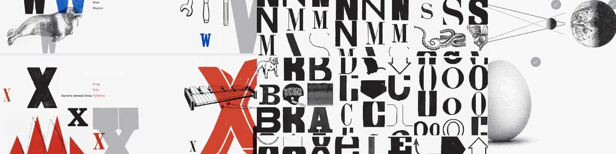
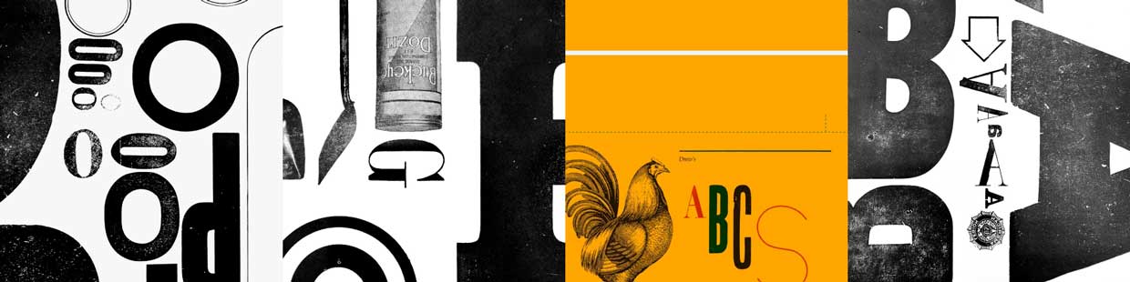
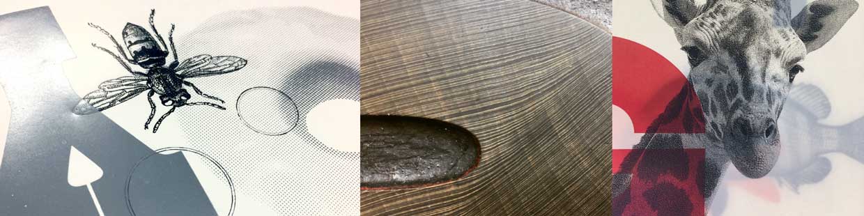
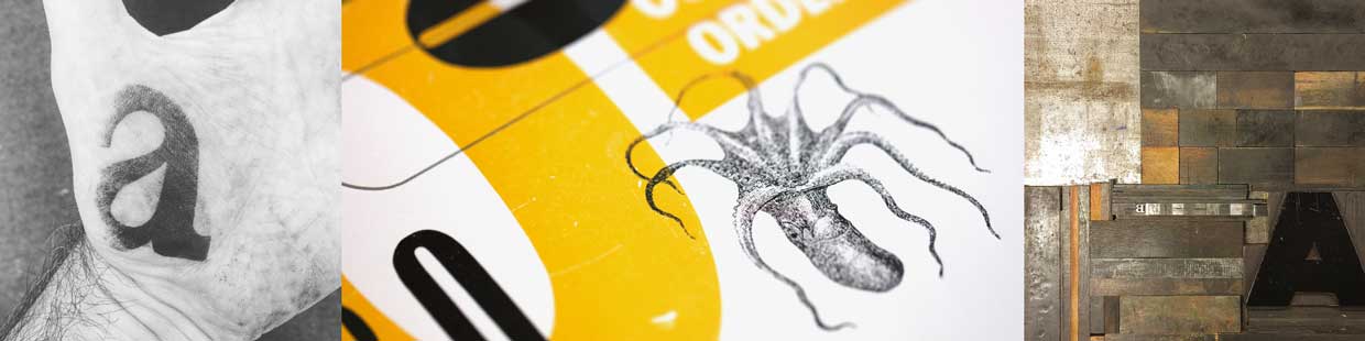
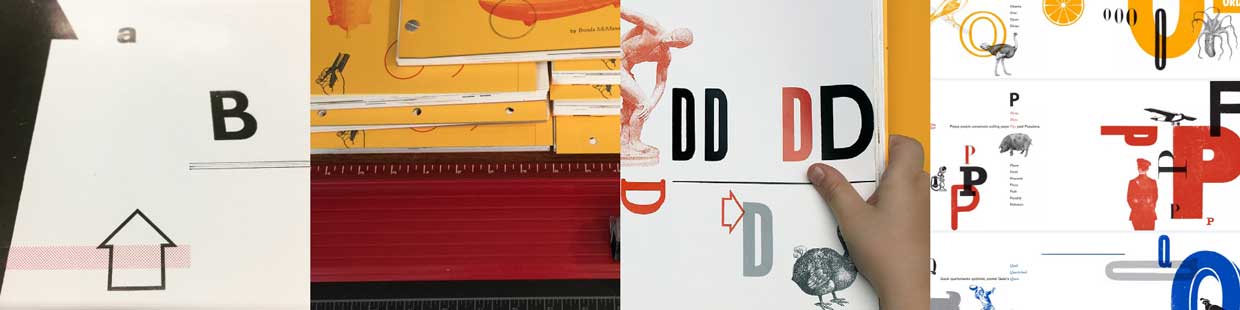
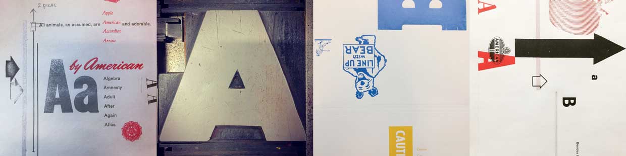
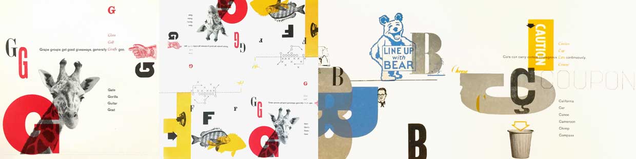
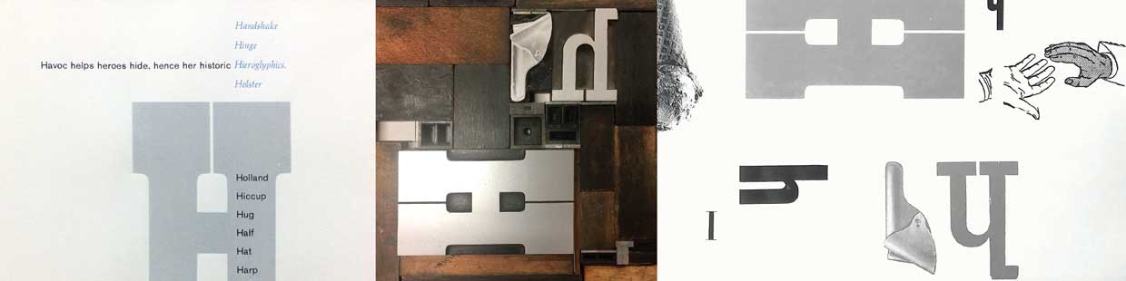
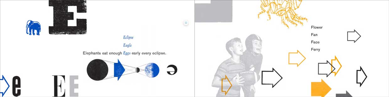
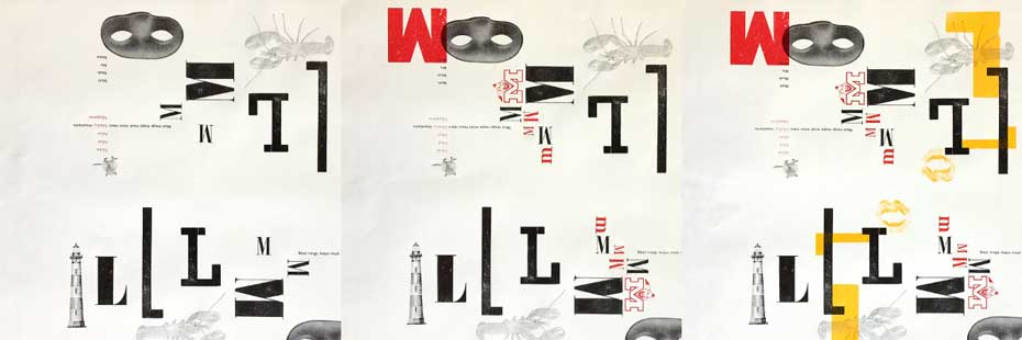
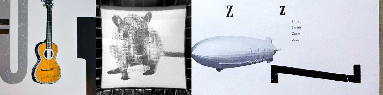
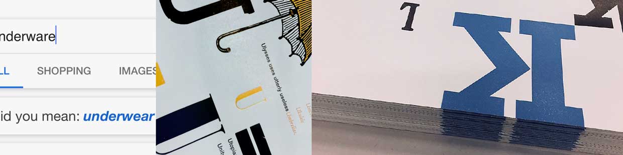
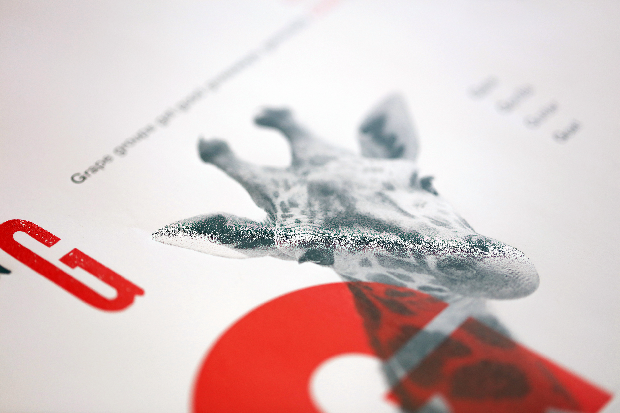
The design of the book presents various playful tongue twisters (in the spirit of Dr. Seuss) and silly phrases in an attempt to emphasize the letter > word > image relationship. Each spread is devoted to an alliterative sentence, for instance: “Peppy people perpetuate putting paper Pigs past Pasadena.” A key word is highlighted (capitalized and emphasized by color) and illustrated via a line engraving in each sentence.
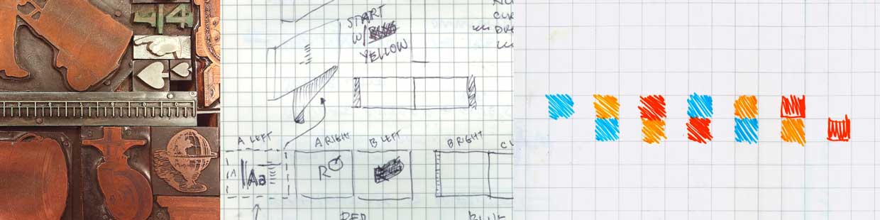
Additional words are included in each spread to allow readers to practice pronouncing words that start with the same chosen letter—for instance the “P” spread would include: Plane, Point, Peacock, Pizza, Path, Parallel. Supplementary images are also included within each spread to reinforce the image/sound relationship through multiple readings and visualization. Lastly, alternative interpretations of letterforms and their design are included to provide young readers with an expanded exposure to the variety of letters that they will encounter in the world.
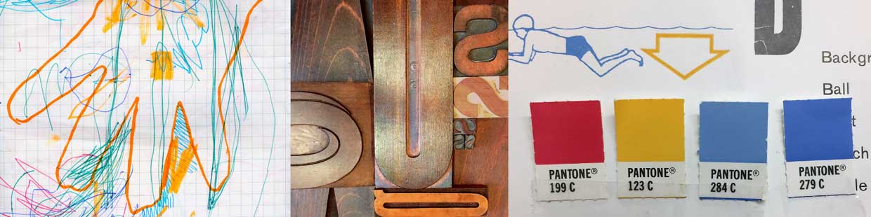
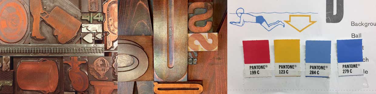
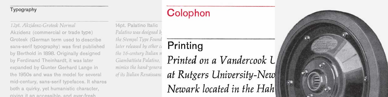
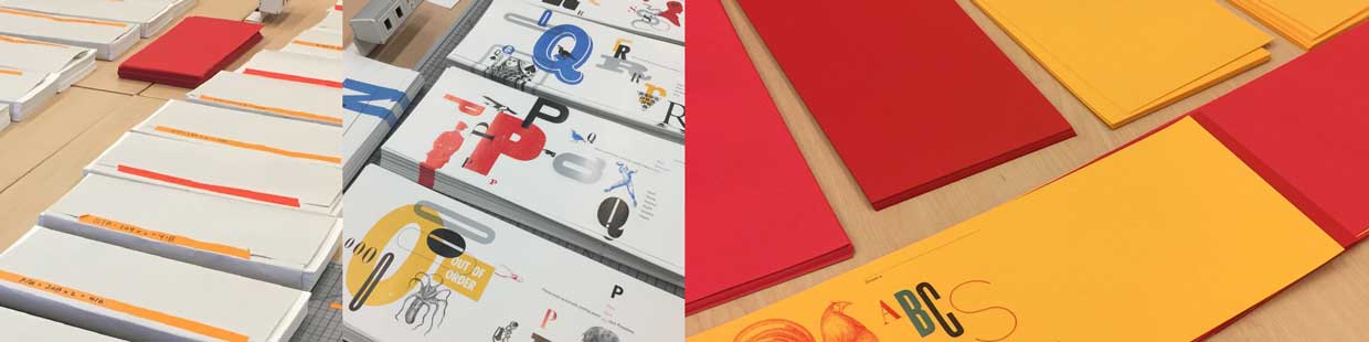
The overall concept and design of this project revolves around a simple belief in the “basics” and avoiding unnecessary complexities whenever possible. We also purposely chose a subject matter (children’s ABCs), color palette (primary colors) and printing process that reflect our commitment and love of these founding principles. This perspective allows us to focus on creating parallels between the book’s design/production and the reading/learning processes.